Learning CSS grid layout with the Swiss
I wrote this article not like a tutorial with a step-by-step detailed explanation, but it’s rather a diary of my experiments with the Grid layout.
By tradition, let’s start with with a little history.
I connected these two themes — Swiss Style and CSS grid layout not only because they have one common thing — Grid, but also because the Swiss grid is an evolution of the Grid, a golden era in my opinion. And it’s much funnier to compare and reproduce examples from the best.
What is the Grid and why is it so important?
In CSS — a grid is a modern way to build a layout for a web page. We will talk about the CSS Grid Layout. Before, we had only the block layout and lately, the flex-box layout. Flex box saved the day, because the layout based on inline-blocks was very limited. We’ve got such thing as flex-direction, flex, justify-content, align-items and other cool properties from it.
But so far we didn’t have the actual grid; we are made it by different techniques.
//for instance like in that sample.col2{
   width: 20%;
   margin-right: 20px;
}
And only now In our lives, modestly and shyly enters Grid layout. Suprisingly for someone, Grid layout came from Microsoft proposal to CSS Working Group in 2011. In 2015 according to caniuse.com Google Chrome added Grid Layout in “experimental Web Platform features” release from July 2013. But who wants to use something which supported by no one? And only in march 2017 most of the browsers start to support Grid layout.
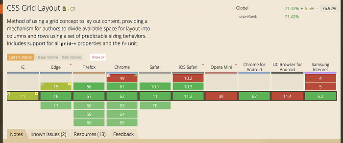
Grid layout allows us to create real grid not only in one dimension like in flex-box but rows and columns in the same time and adjust it as you want almost without any limits. Grid layout also will be understandable for you if you used flex-box cause is contains some of it properties.
And in real life grid it’s a key stone for building layout for… everything.
Everything from books, newspapers to cd-covers and packing contains grid system or deliberately breaks it.
Grid system it’s a rhythm, movement, a key to build enjoyable and balanced layout.
There was a lot of people who contributed in grid layout rules and principles. That is why we can’t say “This guy made everything” but of course we can emphasise key persons and principles. Among these well-known principles are the Golden ratio and fibonacci series.
The first grids were introduced in 1900 by “Modulor” by Le Corbusier and “Dynamic symmetry” by Jay Hambidge in 1920.
These two books describe examples in history and explain how to build a proportional and satisfying layout.

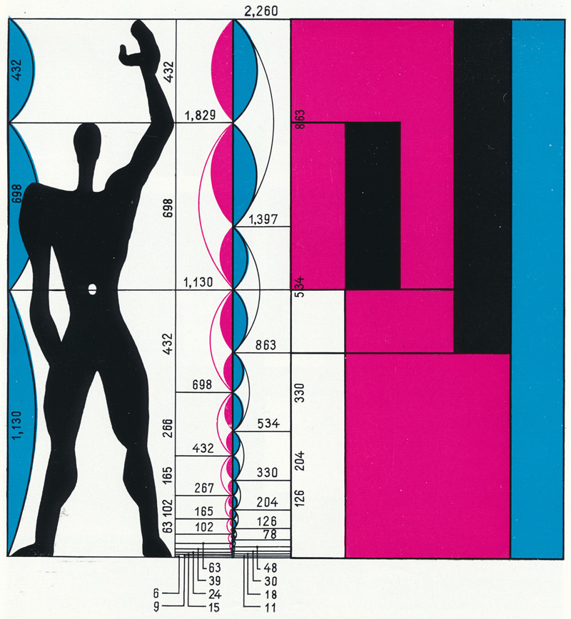


All renaissance is based on a grid system. Artists used dynamic symmetry and grid to build a better composition. Literally you can take any picture and find these rules.

Traditions and style of designing books for instance developed in a relatively short time from the beginning of printing in 1454 until the end of the 15th century.
But basically, the grid system has always been, even before our era. Grid means order and layout. Ancient books of our ancestors used layout to order text —make differentiation between headers, basic text, footnotes etc., building composition, making a rhythm.
Let’s take, for instance, newspapers and magazines. Nowadays this market is squeezing out by digital or web media year by year.
But the web in infancy had almost nothing. On the web, our first grid system was CSS Tables. And all young web-sites were built on CSS tables. And first designers didn’t know what web-sites were and which approach they needed to use.

People were very resourceful with tables. It was a horrible approach but we didn’t have anything except tables. And, unfortunately, we still have to write disaster code if we are talking about emails. I sympathise with you 😢😭😓

Like I mentioned then we had block-layout and finally flexbox. The last one, flexbox, is very good in terms of adjustment — really cool, but flexbox didn’t have the main feature —grid. For me, the appearance of the CSS Grid layout was just a matter of time because the community wanted it. The CSS Grid Layout was developed for 10 years.
We will discover the CSS grid layout in the beginning with examples of newspapers, magazines and Swiss layouts in the end.
1. Simple grid
The most obvious presence of a grid is newspapers. Newspapers always stick to the grid system as other print media. But like in early web design in the beginning, the grid and content were straight and strained. They didn’t use paddings and margins properly, the main principle was the maximum concentration of content on the page.


But the situation start to change in the 1900s. Papers started to use the grid system much smarter, using gutters (margins) between modules in the grid instead of hairline. Think about composition on the page and about rhythm.


Let’s build a simple grid from this example. Allen Khyorlbert called this layout of the Herald newspaper a great example of modern newspaper design, in 1971.
Massimo Vignelli applied a six-column grid (top) consisting of 102 rectangles with the ratio of the sides of the double square.
I’ll try to explain what am I doing during the narrative and will skip a part where I should tell about all basic things. But I left a link to the article on css-tricks here.
Also, I’ll use Stylus as CSS preprocessor and Pug as HTML preprocessor.
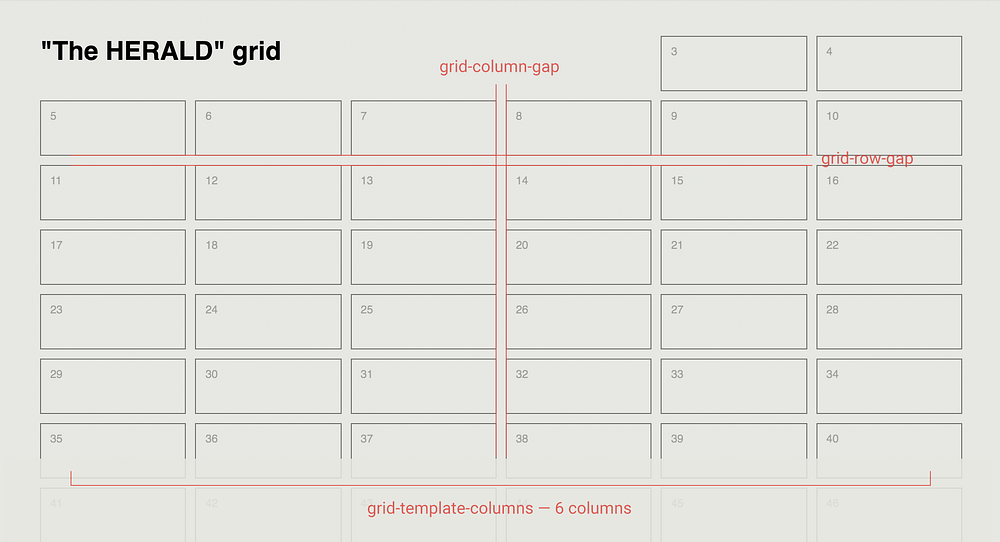
It’s our first example, basically just a grid/skeleton. Now, let’s break down that grid. The first CSS part is for a wrapper.

display: grid initialisation of the Grid Layout.
grid-template-columns: 1fr 1fr 1fr 1fr 1fr 1fr set up 6 columns. Here, the fr unit allows you to set the size of a track as a fraction of the free space of the grid container.
grid-row-gap: 10px and grid-column-gap: 10px are margins between cells.

And for the header we will use start and end property. You could adjust how many columns will be in width and the same for height of an element by these properties.
There is a short way to write start and end property:
.header {
  grid-column: 1 / 5;
}
Okay, now we know how to create a simple grid… and it’s really easy.
For the next example we can usegrid-template-areas.It’s a very common situation for most web-sites — they all have this pattern. We used to create layouts for footer, header etc by additional classes and helpers in CSS, which is not so comfortable and easy if you do this by Grid Layout. Grid-template-areas is a modern way to make a layout, literally by ASCII-graphics. So we can make a layout like that:


I brought this example from Vadim’s Makeev video about Grid layout. I think it’s the best explanation. Unfortunately this video available only in Russian.
2. Making of a magazine layout
We are trying to reproduce print media here, so, we will change the game a little bit and will rebuild a couple of pages of Tunica magazine by London studio Julia. I took this example because it contains straight layout — header, content and footer.


I see a six-column layout here, not too much 🙂
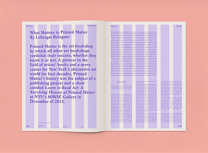
But I’m not sure about rows I don’t see an easy pattern here. I counted about 34 rows.

First, I think what we need to create a base 6-column grid.

For columns, we are using a repeat notation, because they all have the same size and we know, we have only 6 columns. But for horizontal rhythm we don’t know how many rows we will have in different blocks. So, to solve the problem, we can use grid-auto-rows property, where we set the size of an grid row, but we don’t specify how many rows the page will have, only the size of rows.

Next we will create three general parts — header, content and footer areas.

a. Header area
This part is simple because the header occupies whole 6 columns and contains only two elements — magazine title and issue number.
For the header, we write grid-column: 1/7 which means from the first column to the 6th column.
And for the inner element we use flex-box property justify-content: space-between to align elements on opposite sides. Flex-box and Grid layout work together pretty well. And where the Grid layout seems too complicated, it’s better to use flex-box.

b. Content area
Content area occupied 6 columns, and we will make all adjustments separately for different layouts inside the content area. In an ideal world where CSS properties are always «green», we could use subgrid property for a nested grid, but so far we will use basic syntax.

c. Footer
Because we know how many elements contain a footer and how long they could be in terms of content we could specify rows as well — 3/5 which means 2 rows.

But the footer is more complicated — we also could break the footer into several pieces.


You may have noticed that I am using Stylus as a preprocessor. It’s very helpful when you work with BEM.
A code for the footer above contains familiar Grid layout properties, except align-self property — this property aligns the content inside a grid item along the column axis (as opposed to justify-self, which aligns along the row axis).

All elements in the grid will look like that:
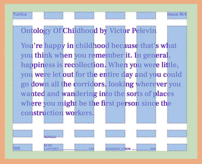
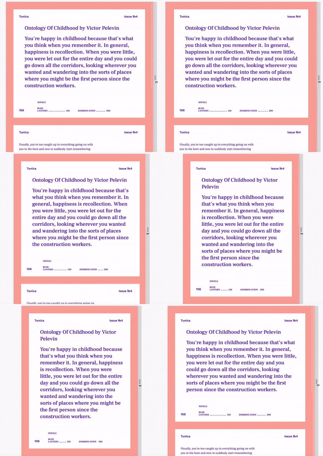
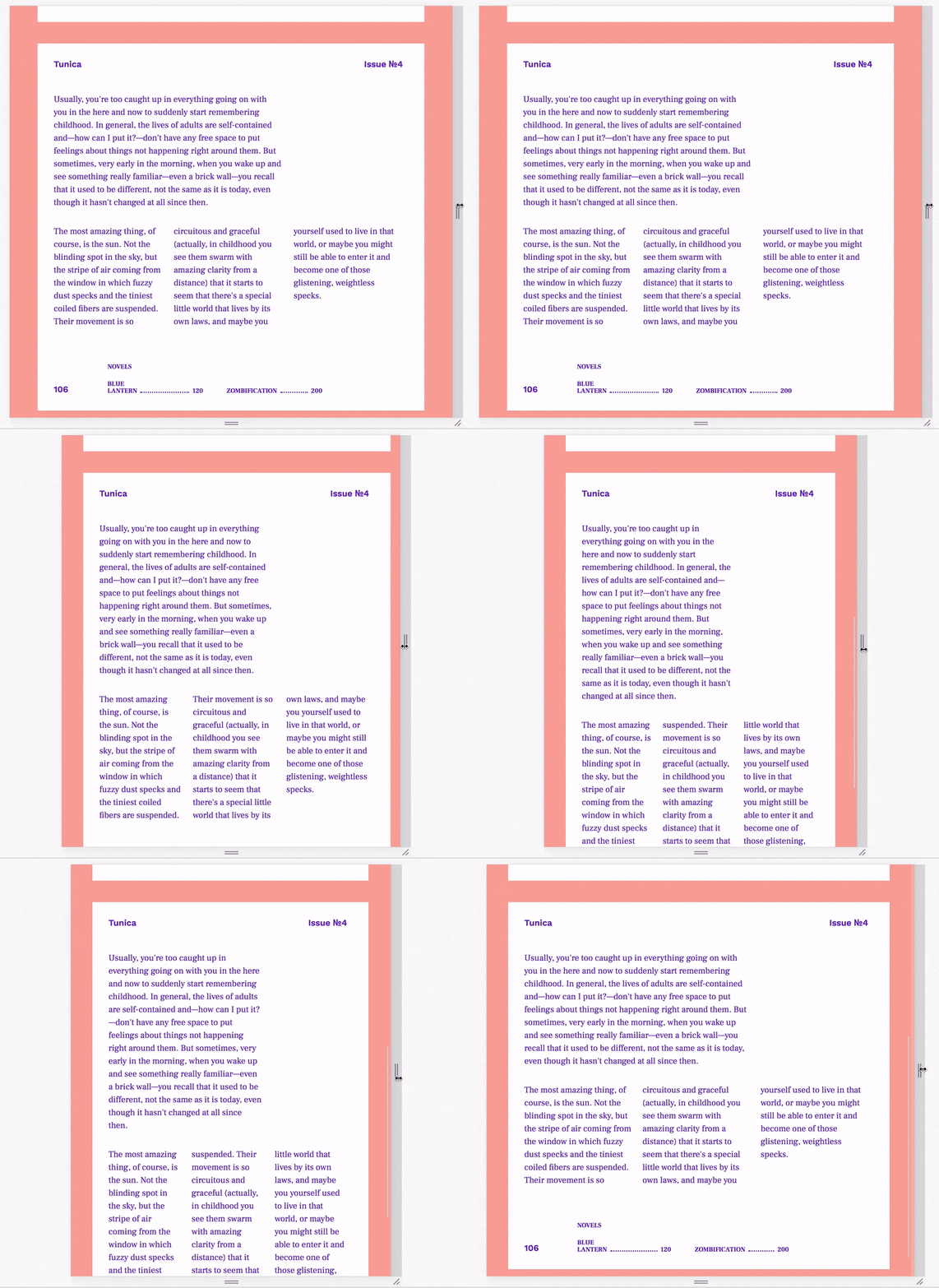
Everything is built with grid layout, but for the second page, we used CSS columns. Because the Grid layout was not made for text (only), we need a responsive three column text.

So far to build the page we mixed three CSS layout systems:
- Grid layout for the general layout and blocks.
- Flex-box for inner elements, layout inside grid layout blocks.
- CSS columns for the second page trick with responsive column text.
3. Swiss style
The next evolution for our examples will be the crown of the style inscribed in the grid — Swiss style.
Of course when we talk about Swiss style we cannot fail to mention Joseph Müller-Brockmann. For modern graphic designers, he is a pop star and famous among recent web-designers, due to his book “Grid Systems in Graphic Design”, which provides a history of the grid system and a lot of examples, thoughts about the grid and how to use it.
Joseph Müller-Brockmann can be classified as part of the Swiss International Style. He was influenced by the ideas of several different design and art movements including Constructivism, De Stijl, Suprematism, and the Bauhaus. He is perhaps the most well-known Swiss designer and his name is probably the most easily recognized when talking about the period.


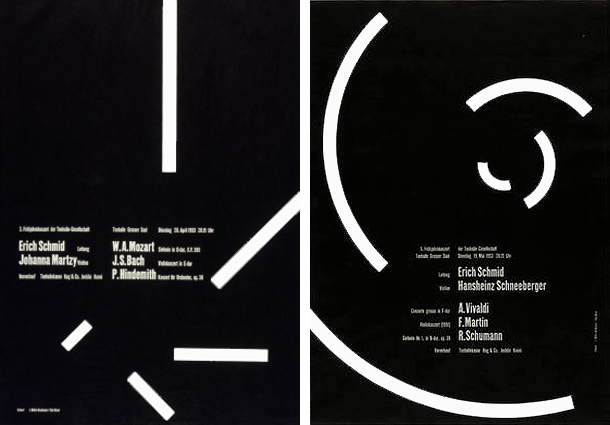


Müller-Brockmann’s work is a rise of the grid system. It’s very strict not like New Wave style (we will talk about this style later). That’s why it’s very easy to reproduce his style in CSS using a Grid layout.
According to Jon Yablonski work with his respect to old masters I also tried to reproduce Swiss posters in typography, using a “modern” CSS grid layout.
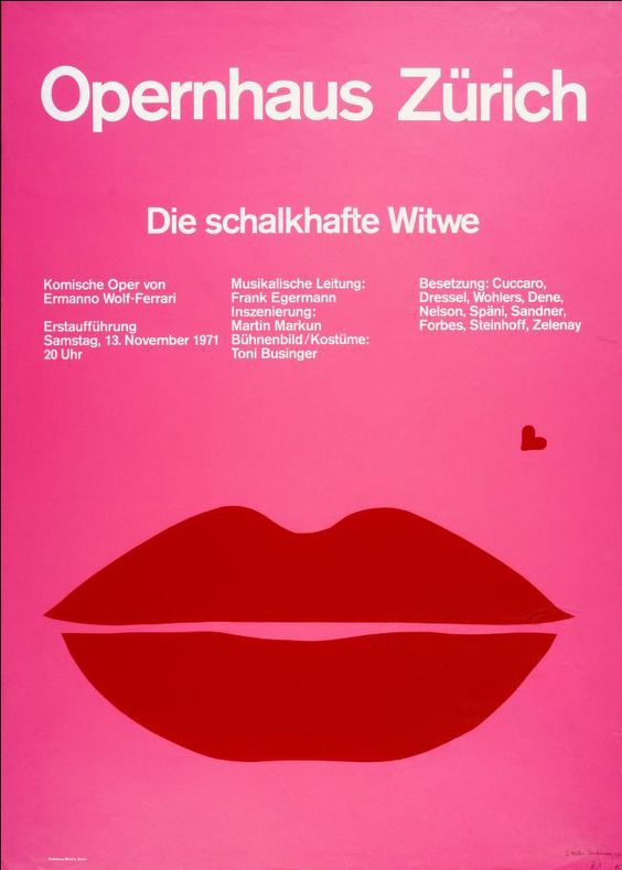
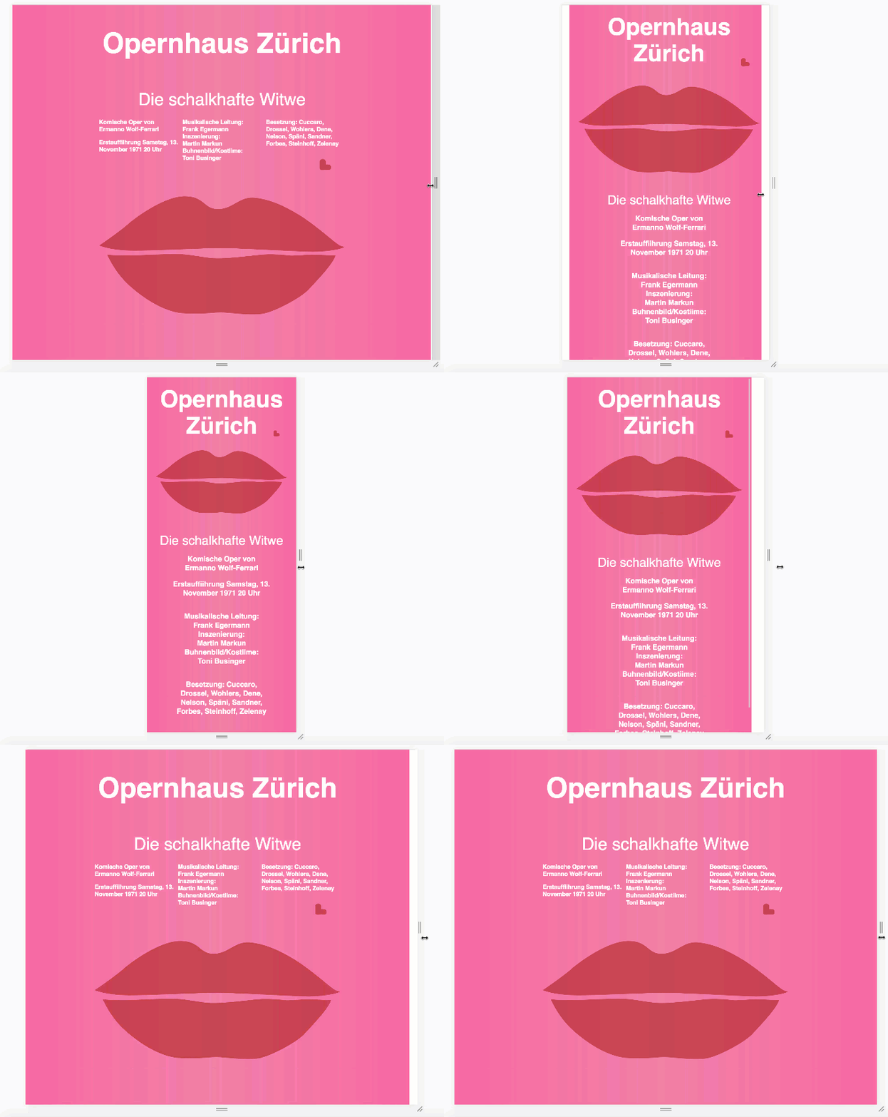
Below, I provide poster examples made by Müller-Brockmann. So as not to stretch the article too much I’ll include only examples without explanation.
Joseph Müller-Brockmann
Pure grid — with full fixed rows and columns

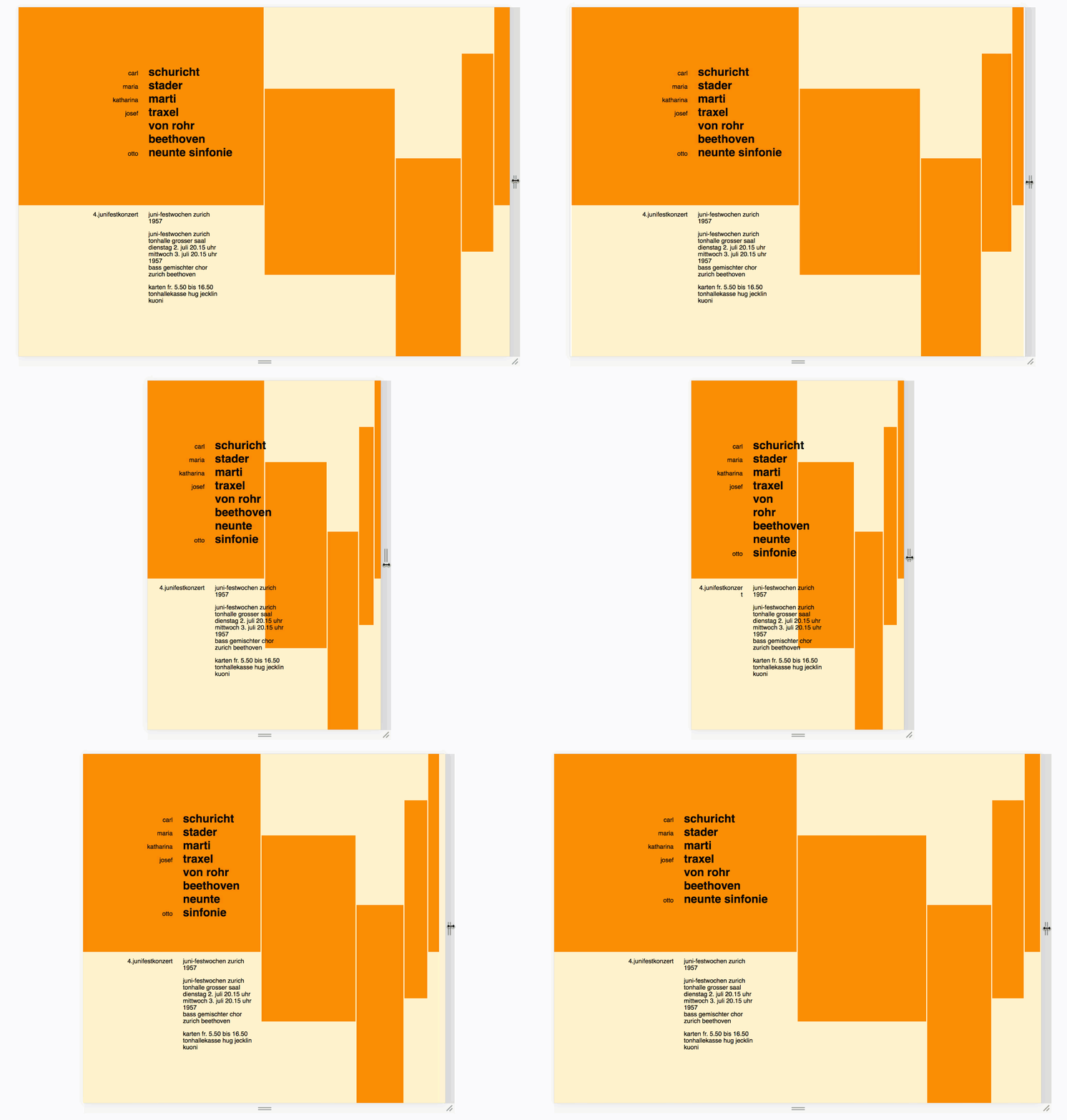
Grid with floating height of the text block

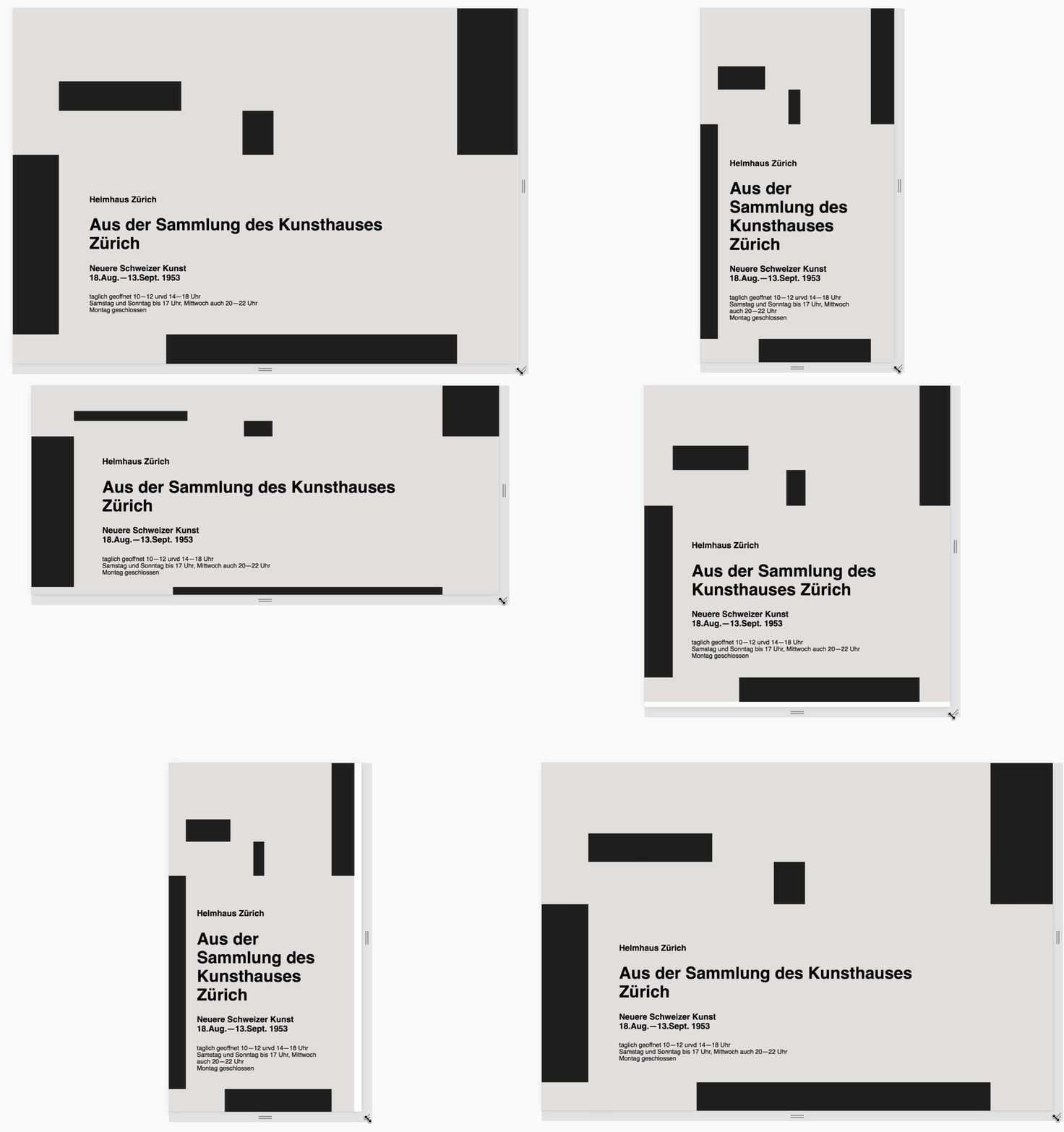
Grid areas and media queries
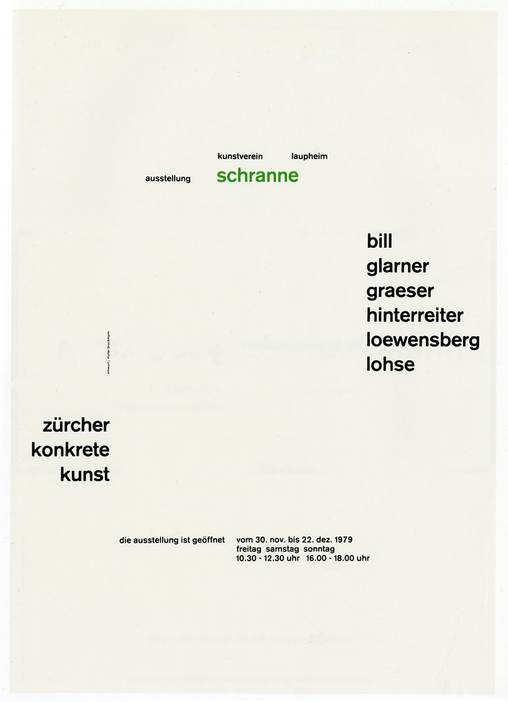

Floating row sizes and media-queries
Making a New Wave
This sub-genre will be a little difficult, because it breaks a grid logic; it’s actually completely different from the classic international style. We will reproduce the New Wave style. Let’s start with an introduction, and the first name will be Wolfgang Weingart.
Wolfgang Weingart is claimed as “the father” of New Wave or Swiss Punk typography. According to you wiki New Wave or Swiss Punk Typography born in the 70s at the Basel School of Design, Switzerland. A break from the grid structure meant that type could be set center, ragged left, ragged right, or chaotic (compared to Joseph Müller-Brockmann it’s truly chaotic).
New Wave — it’s chaos without a grid but led by composition.
So, like I mentioned, New Wave basically breaks the rules of the Grid.
Grid is useful where it is, where you can see a strict pattern; in other cases, use Flex-box. It fits very well for New Wave, and the absolute positioning property inside relative will help you there 🤗
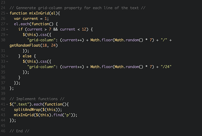
Another important aspect is chaos — New Wave is a random, and setting up everything and doing everything manually in CSS is tedious; instead, mix it with JS.
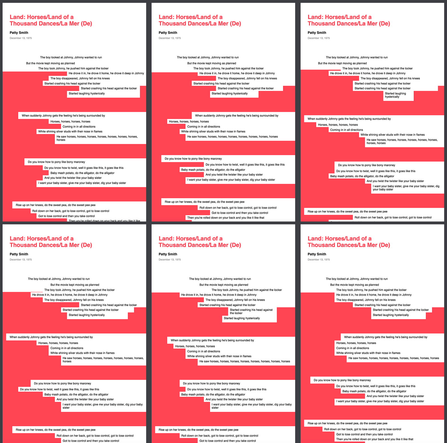
A couple New Wave examples are shown below. Experimenting with them using a Grid layout could be a real headache. We will need to use a lot of Random functions.
Example one

I made this example mixing Grid layout and a little bit of JS

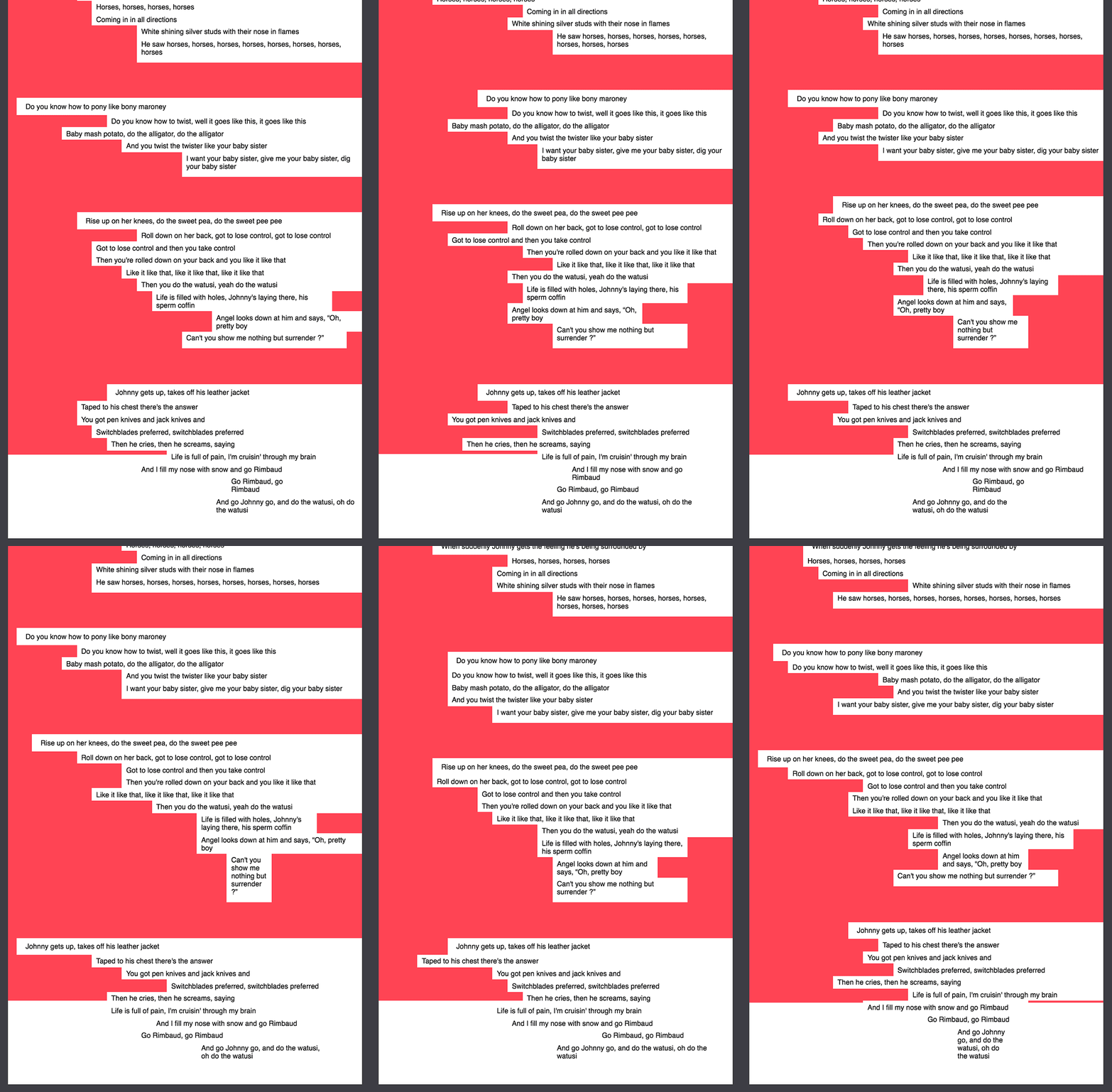
For this example, I picked one of my favorite songs by Patty Smith. I modified the initial grid and, made it random, so every page refresh will give you a new result.
Example two
For this example I will take a few references from Wolfgang Weingart experiments.


I also used JS random function to create this grid.

In conclusion
Working on this article, I realised the Grid Layout is not a panacea for everything and it can’t solve all problems with a layout, because despite the fact that most web-sites fits to the strict pattern a lot of elements should be more flexible. But the grid layout is a very helpful and great addition to flex-box (or opposite).
Thank for reading! Have a great new year everybody ;-)
What to read
- Swiss style inspiration #1 — typoteca.ru/page-3
- Swiss style inspiration #2 — www.pinterest.co.uk/shcherbyna/poster-swiss
- All about Grid layout —css-tricks.com/snippets/css/complete-guide-grid/#prop-grid-auto-columns-rows
- Posters searcher — www.typographicposters.com/posters
- Things I’ve Learned About CSS Grid Layout — css-tricks.com/things-ive-learned-css-grid-layout
- Building Production-Ready CSS Grid Layouts Today — www.smashingmagazine.com/2017/06/building-production-ready-css-grid-layout
- A Brief History of Grids —www.graphics.com/article-old/brief-history-grids
This story is published in Noteworthy, where 10,000+ readers come every day to learn about the people & ideas shaping the products we love.
Follow our publication to see more product & design stories featured by the Journal team.
