How to create a Pan`n`Pinch component for a Figma plugin. Step-by-step Recipe.
Hallo, Leute!
Today I want to shortly describe a component that I wrote for one of my plugins — WarpIt. And I want to share my experience with you.
There were some pitfalls during the coding process but not too much. And what I like here, that at the end the component code looks very clean and understandable.
Just a quick disclaimer — I write all my plugins with React and here as well I will describe a react component. But it doesn’t mean that you can’t take the code and rewrite it a little for your framework or even with the vanila JS. The component is fully isolated and doesn't have complex hooks, only basic event triggers, and targets.
Research
Before I started to write my own plugin, I was trying to find something that would suit my needs.
- Pan gesture support(because I work on mac and use the touchpad a lot)
- Hold
Spacebar+left mouse clickand move the canvas (in case if a user uses a mouse) - zoom in/out by pressing +/- or by pinch gesture, and zoom in/ by
ctlr+mouse wheel
So, basically, I wanted to repeat the same behavior that Figma has.
I found about three libraries. But all of them contain a lot of extra settings and code that I don’t need. It also was very hard to customize them and something in addition, because I wanted pretty specific behavior and all of these libraries were more for maps or to zoom pictures, but not to handle canvas navigation.
The component layout
The component itself is pretty simple it consists of two parts


We will create the component without any additional libraries and we need to import only React here.

then we will need to specify custom prop types. I’ll it means that we will have some props that could be adjustable. I’ll add to custom props:
- panSpeedRatio as a
numbertype — it's an index of the pan speed. If we want to make movement faster, just increase this prop. By default, it is 1.4. - test as a
booleaantype — true or false. This property will make all containers of the component visible. It could be helpful when you develop and test the plugin.

then goes the layout:

Right now there are no functions. We will add them later.
and default prop values:

Handle styling
For the wrapper the overflow will be hidden because the width and the height equal 100%. To position the container inside the wrapper we will use flex layout and additional justifyContent and alignItems it will work like position: 50%, 50% and center the div inside by horizontal and vertical.
For the container inside, we will use the fit-content rule. It means that the container will take the size of the children container.

`testMode` property
This is simple. We create an object that contains styles that we will add when the test property is true.

now we’re able to see our containers. Let's add the current PanAndPinch component to the application.
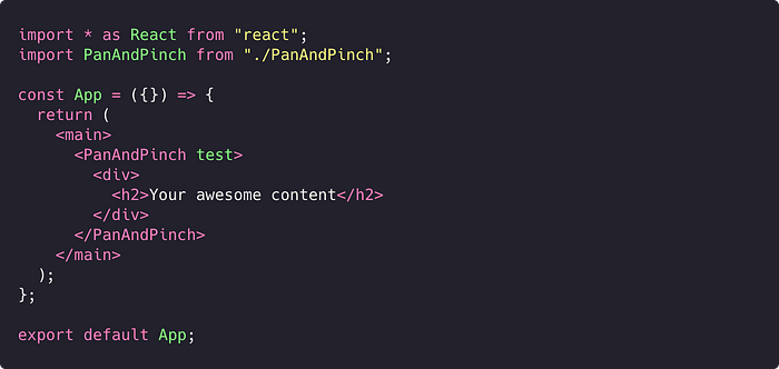
To pass children in our component we don’t need to write any additional props — react will handle it for us.
App.tsx will look like this:

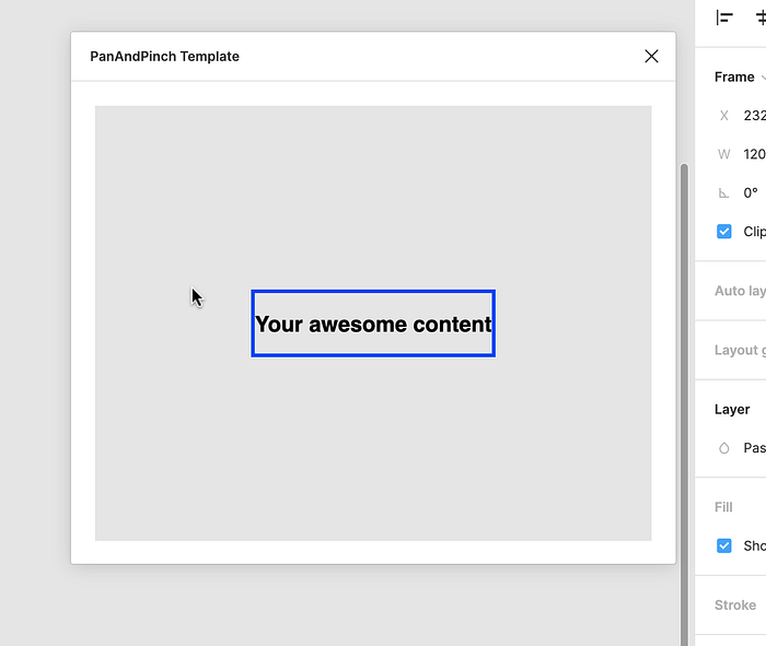
And when we start our plugin we will see this:

the wrapper has a slight greyish background and the movable container has a blue border.
Handle gestures and actions
Handle Pan
To handle the pan gesture we will track mouseWheel events — deltaX and deltaY this is the impulse. The strategy here is to capture this impulse and each time when we detect it we will add it with the previous value.
The pan gesture is the gesure that work on touch panels.

We will save the X and Y values in the spacial state transform. We will also save here scale value but this is for later.

Handle Click Drag or `Spacebar` + `Click` and mouse move
Much trickier but pretty common pattern.
here we will need to track the mouse position and translate it to the container position.
To do so, we’re adding two states:
spacePressed— to detect when the space bar is pressedmouseKeyIsDown— we will detect when the left mouse key is pressed (also will work for laptop trackpads)
To be able to track these states we are adding onKeyDown or onKeyUp functions to the wrapper div and also don’t forget to add a tabIndex. Unfortunately without tabIndex it wouldn’t work.

Events like mouseDown and mouseUp we will track with the old fashioned way — we will use document.addEventListener in React.UseEffect
Handle Pinch effect
Terns out that it’s an easy effect until you will want to add something extra like an animation.
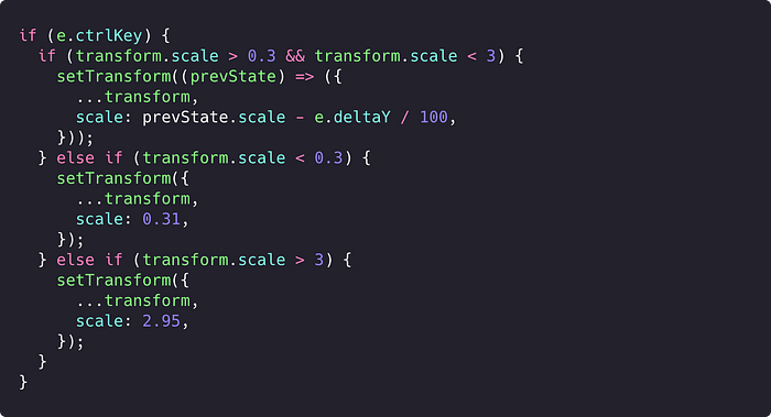
We will add this function into handleOnWheel

What is happening here — if the mouse wheel event is active and the ctrl key is pressed, this combination triggers pinch-to-zoom effect. Then we’re taking the wheel deltaY and apply it to the transform:scale.
Also we will set two restrictions here for the maximum transform.scale > 3and the minimum scale transform.scale < 0.3.

Three these items will cover basics, but this is not all.
Let`s also add more possibilities:
+/-keys to zoomctrl+mousewheel- on
0key set all transforms to the initial state
Due to we need to return the container to the maximum and minimum scale in several places. We will write a function returnZoomMinOrMax
To be able to zoom in and zoom out the container we need to write a checker that will check if we click in the right key. In our case plus or minus.

And lets also make maximum and minimum zoom values as component props, to be able to change it whatever we need it.
Full component description you can check on the GitHub repo below 👇🏾
Demo version 👇🏾
